

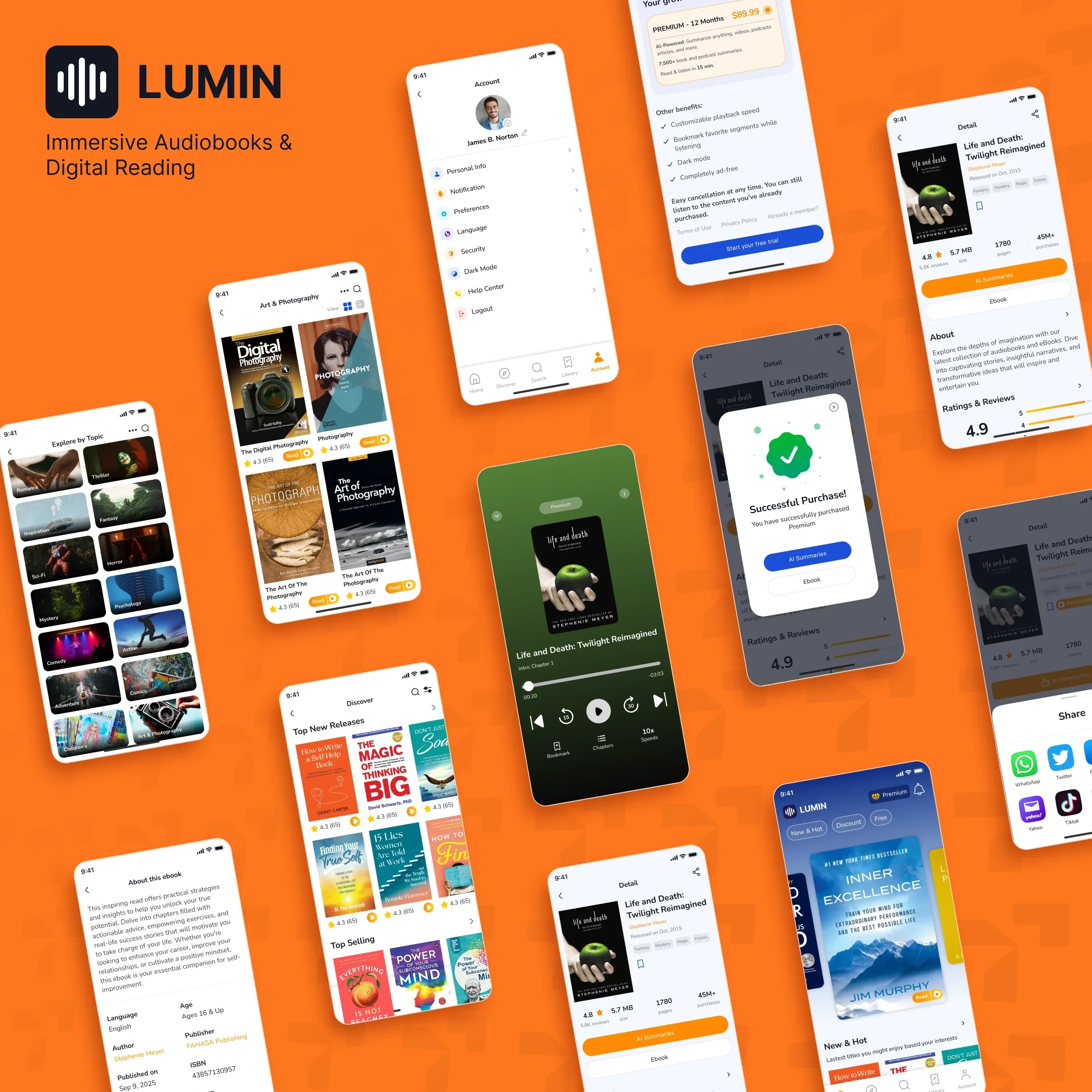
Lumin is a mobile reading and learning app for people who want an easier way to discover books, read or listen to them, and return to saved content later.
The product brings together book discovery, personalized recommendations, ebook reading, audio playback and library management in one mobile experience.
“The goal was to make Lumin feel less like a digital bookstore and more like a practical learning app people could return to regularly.”
The design challenge was to support a large feature set without making the app feel heavy. Users can move from browsing a title to reading, listening, saving and continuing later through a consistent interface.
Lumin has more going on than a typical ebook reader. The interface needs to handle recommendations, categories, detailed book pages, reading, audio playback, saved books and notifications without turning the experience into a maze of screens.
The priority also changes depending on where the user is. The challenge was making those transitions feel natural while keeping the visual language consistent.
Discovery comes first. Rapid cover scanning and curated shelves let readers uncover compelling titles in seconds without friction.
The focus shifts to title typography, synopsis, ratings, and immediate action buttons so users can instantly decide whether to read or listen.
Almost everything else gets out of the way. Distraction-free typography, subtle margins, and tactile controls fade until requested.
The product was structured around how someone would realistically use a reading app rather than around a long list of features.
A typical journey might start with a recommendation, move into the book details, continue into reading or audio playback, and end with the title being saved for later.
Home and discovery screens use content rows that are easy to scan. Detail screens provide more information without hiding primary actions. Reading and listening screens reduce visual noise. Each part of the app has a different job, but still feels like part of the same product.
Lumin’s interface is based around a strong blue primary color, supported by a brighter set of category and accent colors.
Orange, yellow, cyan and purple are used selectively across supporting elements and content areas. These colors add variety where the interface needs it, particularly around discovery and category-driven content.
Rather than using a decorative visual language everywhere, the brand is strongest in the parts of the app where users make decisions or move between sections.
The book-detail page brings together the information users need before deciding whether to continue.
Book artwork and key details appear first, followed by clear reading and listening actions. Description, ratings and supporting information sit further down the page.
High-resolution cover art, title, and author anchor the topmost focal plane for instant visual identification.
Direct launch actions remain immediately accessible above the fold without requiring down-page scrolling.
Comprehensive book summaries, publisher notes, and social verification reviews provide deep decision context.
Related titles continue beneath the main content, providing intuitive exit routes if the current book isn’t a match.
Personalized and recommended titles continue beneath the main content, giving users somewhere to go if the current book is not right for them. The layout keeps primary actions easy to find even on a long content page.
Lumin supports both ebook reading and audio playback. Both experiences are treated as two ways of accessing the same content rather than separate products inside the app.
The ebook reader keeps the focus on text while making chapter navigation and reading settings available when needed.
The audio experience uses a more control-focused layout with playback actions kept easy to reach on mobile.
The Library gives users a direct route back to saved and previously selected books.
Book covers remain the main visual identifier, making the screen quick to scan even as the collection grows.
Unlike the discovery experience, the Library is intentionally simple. Users have already made their choice; the interface mainly needs to help them find it again and continue.
Lumin includes notification states for new books, recommendations, updates and promotional messages.
The screen supports both populated and empty states, so it still feels complete when there is nothing new to show.
When notifications are available, each item is structured so the subject and reason for the update can be understood at a glance.
Tayvora solutions is a creative design and Digital agency for startups, founders, product teams, and global brands that need strategy, design, development, and visual communication working together. From brand identity and websites to pitch decks, digital products, and motion graphics, we help build the creative system behind your next stage of growth.
Select all services and creative capabilities your project requires.
Help us align the team and execution velocity with your targets.
Where should our executive team send the proposal and initial concepts?
Thank you for connecting with Tayvora Solutions. Our creative directors are reviewing your project parameters and will reach out within 24 hours.